Visualizing passages of music
Jul 05, 2016
A long-standing challenge in the dissemination and study of Indian classical music has been accurate and efficient notation. The most commonly used notational system, developed by the lawyer and musicologist Vishnu Narayan Bhatkhande in the early 1900s resulted in the preservation of many compositions and songs that may otherwise have been lost. Nonetheless, pieces reproduced automatically from Bhatkhande notation are incomplete in that they lack many of the features that give Indian music its characteristic sound, a quality that even greats like Leonard Bernstein have inadequately referred to as “boing”
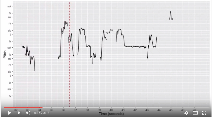
One way to address this has been using pitch versus time graphs that allow the viewer to observe different ornamentations of the transitions between notes. Building upon work by many in the field is my attempt to automatically visualize pitch over time. If you like what you see and think it would be useful to you in your study of music, do read on for a brief background of the field and the methods I used.
A few years ago, Wim van der Meer and Suvarnalata Rao published Music in Motion, a database of Hindustani recordings that enable viewers to visualize changes in the performer’s fundamental frequency over time. They used PRAAT, a software for phonetic research developed in Amsterdam University for melody capture. Their implementation of the melody extraction algorithm in PRAAT works best for monophonic recordings containing only voice.
Justin Salamon and Emilia Gomez of the the Music Technology Group of the Universitat Pompeu Fabra in Barcelona developed a method, Melodia, that works for polyphonic recordings containing a lead instrument or voice along with accompaniment. Luckily for many of us, they made their algorithm easy to use via a VAMP plugin for Sonic Visualizer and within Essentia, which is an open source C++ library with Python bindings for audio information retreival.
I decided to try using Essentia to see if I could automate visualizations in the way Rao et al. did. Installation was easy. Essentia’s extensive documentation and tutorials made implementation a breeze. Below is what I used to get time versus frequency data.
import essentia
from essentia.standard import *
loader = essentia.standard.MonoLoader(filename = '/path/to/yourfile.mp3', sampleRate = 44100)
audio=loader()
pExt = PredominantPitchMelodia(frameSize = 2048, hopSize = 128)
pitch, pitchConf = pExt(audio) #this step could take a while
time=numpy.linspace(0.0,len(audio)/44100.0,len(pitch))
output = np.column_stack((time.flatten(),pitch.flatten()))
np.savetxt('path/to/output.txt',output,delimiter='\t')
To animate the results I got, I divided the frequencies we calculated by the tonic of each piece, also detectable using Essentia. This allowed me to view the results in the solfege space familiar to me. I reverted to R’s ggplot to first generate individual frames of the time vs frequency videos. I’m not going to put all the R code here but as an illustration, I looped through the data to produce images corresponding to each frame of the video I wanted. I wonder if there’s an easier way to do this..
winS = 15 #Time window for each frame in seconds
fps = 10 # frames per second
min=0.6 # lowest frequency ratio (to tonic) I want in the plot
max=3 # highest frequency ratio I want in the plot

# generate plots for initial phase
# (during which the red reference line doesn't move, the pitch graph appears to move behind it)
init = 4 #duration in seconds - initial phase
for (i in  seq(0,init,by=1/fps))
{

  jpeg(paste(getwd(),"/", folder,"/tunePlot",sprintf("%07.0f", fps*i),".jpg", sep=""), width=640, height=360)
  print(ggplot(TvsP[TvsP$Time>0&TvsP$Time<=winS,], aes(x=Time, y=p2))+geom_line(size=0.5)+scale_y_continuous(breaks = c(0.6667, 0.75, 0.8333, 0.9375, 1.000, 1.125,1.25, 1.333, 1.5, 1.6667, 1.875,2, 2.25, 2.5, 2.667, 3), labels=c("fa", "sol", "la", "ti", "do", "re", "mi", "fa", "sol", "la", "ti", "do", "re", "mi", "fa", "sol"), trans='log2', limits=c(min, max))+scale_x_continuous(breaks=seq(0,winS))+ geom_vline(xintercept=i, linetype = "dashed", color='red')+xlab("Time (seconds)")+ylab("Pitch"))
  dev.off()
}
Then I used FFmpeg to stitch the images into a video, along with an mp3 of the source track to give me the result! Easy peasy :)
ffmpeg -framerate 10 -i location/of/generated/plots/tunePlot%07d.jpg -i sourceaudio.mp3 -c:v libx264 -pix_fmt yuv420p yay-video!.mp4